
Photos are full of color combinations that already work, because nature and good light did the matching for you. A palette from a photo is a shortcut to a scheme for a slide deck, a room, a logo or a knitted blanket.
This guide is about doing it well: choosing the photo, choosing the colors, and keeping them somewhere you can use.
Start with a photo that has a mood
Not every photo makes a good palette. These do:
- A sky at dusk. Gradients give you a harmonious run of blues, pinks and oranges.
- A single flower or fruit. Strong main color, with leaf green and soft shadows as support.
- A tidy interior or shop window. Someone already balanced the colors.
- A landscape with one dominant tone, such as a beach, a forest or a snowy hill.
Avoid busy crowds, cluttered desks and photos with strong color casts from artificial lighting, unless that cast is exactly the mood you want.
Choose five colors, and give each a job
Five is a good number: enough to be a scheme, few enough to remember. A common split:
- Background: the largest, usually the lightest or most neutral.
- Main: the color people should associate with it.
- Support: a second color, close to the main one.
- Accent: the small, bright pop, for buttons and highlights.
- Dark: for text and fine lines. A dark from the photo often looks better than pure black.
If two of the picked colors look nearly identical, drop one. If all five are bright and saturated, swap one for a calm neutral, or the palette will shout.
Check it before you commit
- Contrast. If you will put text on a color, make sure the two differ clearly in lightness. Squint at your palette: if two colors blur together into one gray, text will be hard to read.
- Proportion. Use plenty of the neutral, some of the main, and little of the accent.
- Context. Try it next to white and next to black. Colors shift with what is around them.
Making one on your iPhone with Color Hunt
Color Hunt pulls a palette from a photo for you. Open a photo in the app and tap the palette icon in the top bar of the photo screen, and you get the photo’s five main colors, each with its name (Red, Orange, Gray and so on) and hex code.
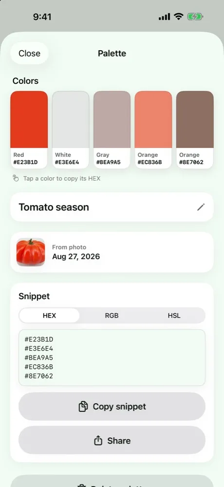
From there:
- Tap a color to copy its hex.
- Switch the snippet between HEX, RGB and HSL, and copy or share the whole set as text.
- Name it and save it, so the palette is in your list when you need it.
The limits, in plain terms: copying and sharing the colors is free. Free keeps up to two saved palettes, so after that you will be asked to go Pro to save more, or you can delete an old one. Photos you caught in the daily challenge are ready in the app; bringing in a photo from your library is one a week for free, and unlimited with Pro.
The five colors are the app’s pick from the photo, so treat them as a first draft. Use the habits above to decide which is background, which is accent, and whether one should be replaced.
The work happens on your device: no account, nothing uploaded.
Using the palette
- Slides and documents: paste the hex into the color field.
- Web: use the hex or the RGB, and the HSL if you want to make a lighter or darker variant by changing one number.
- Crafts and decorating: treat the codes as a guide and match against real samples. A phone screen is not paint.
- Sharing with a designer: the text snippet is easy to paste into a message.
A small exercise
Take three photos on one walk: something natural, something built, something small. Make a palette from each and compare. You will see that your eye is drawn to a certain kind of combination, and that is the start of a personal color style.


